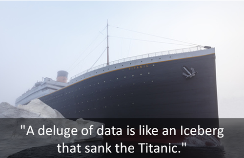
Are we still capable of human wisdom? “But of course!” Most of us will probably give such an emphatic answer. But scientists fear that in an increasingly digital environment, our capacity for “human wisdom—empathy, compassion, altruism, tolerance and emotional stability” is in great peril. We are colliding with an overload of data that is forming into an iceberg. If we don’t do something about it, we could sink like the Titanic.
As knowledge experts, how can we help learners navigate through the flood of information? How can we help learners cut through blocks of statistical information in intellectually and emotionally engaging ways?
Ideas to Try
Start with a short conclusion
Give learners what they need to learn or start with shocking statistics. Darlene Price, president of Well Said, Inc., cited an example of how a vice president of sales for America’s leading healthcare IT company starts her presentations:
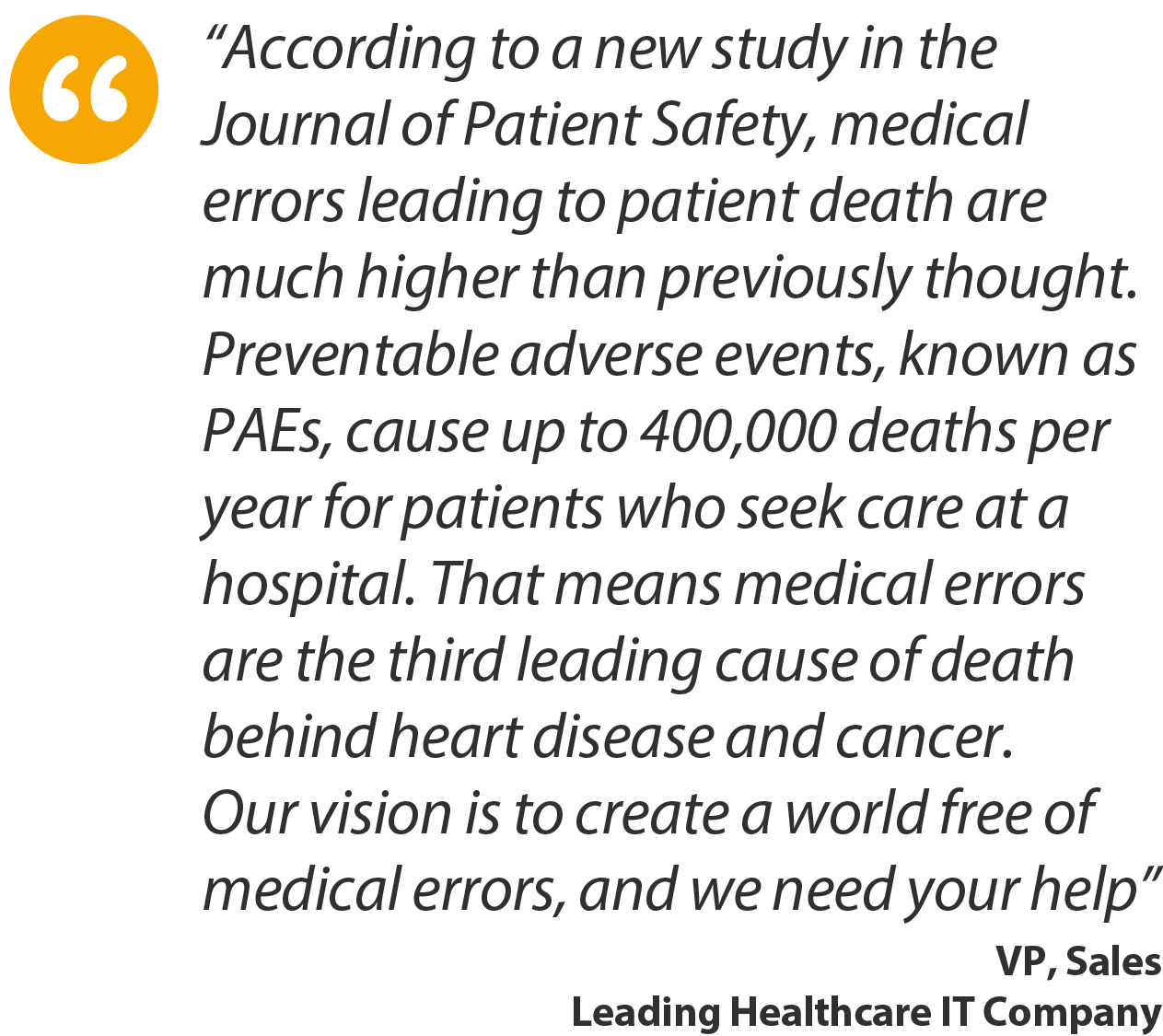
The said vice president of sales is known to have successfully sold software solutions to hospitals.
Map the data
Mapping data enables learners to look beyond the numbers and statistics. Because good data visualization tells a story, the learners are able to understand the enlightening message conveyed (Waisberg).
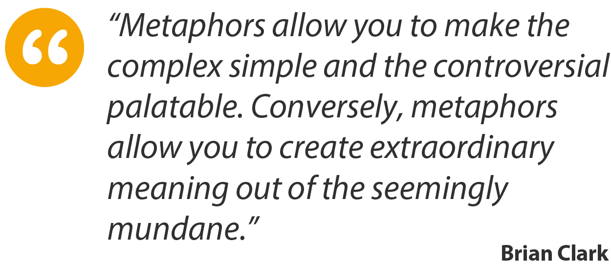
Visualize the data using a metaphor
We can think of data flowing in one direction like streams. While this approach allows us to access information quickly, pulling out the most valuable insights can be difficult because of the rapid flow of streams.
Or we can present data as sunbursts exploding in different directions. Sunbursts show data in hierarchical order. These may not be apropos for making comparisons of elements of precise size but they allow learners to identify notable segments of a complex, multi-layered hierarchy to guide further action.
We can also present data as a traveling timeline.
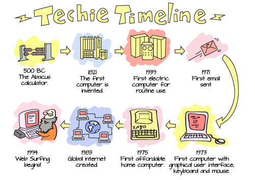
Click here for the enlarged view.
Stories Simplify Large Data
Just as a picture is worth a thousand words, so data also tells a story. But because data is information that is “raw” or unorganized, educators need to analyze and make sense of data first before presenting it to learners.
How can we simplify data? Here are some suggestions:
| |
Extract patterns in data | |||
| |
Convey the meaning and significance of these patterns in the form of a compelling story | |||
| |
Weave data and narrative so that it is tailored to learners | |||
| |
Consider your learners: Tell the right story and ask the right set of questions |
We must remember that humans are naturally inclined to consume stories, not data. So simplifying data and incorporating it in a story that people/learners can relate to, would help learners assimilate information faster. A compelling story based on or supported by data would help learners gain actionable insights.
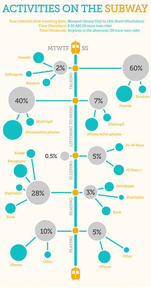
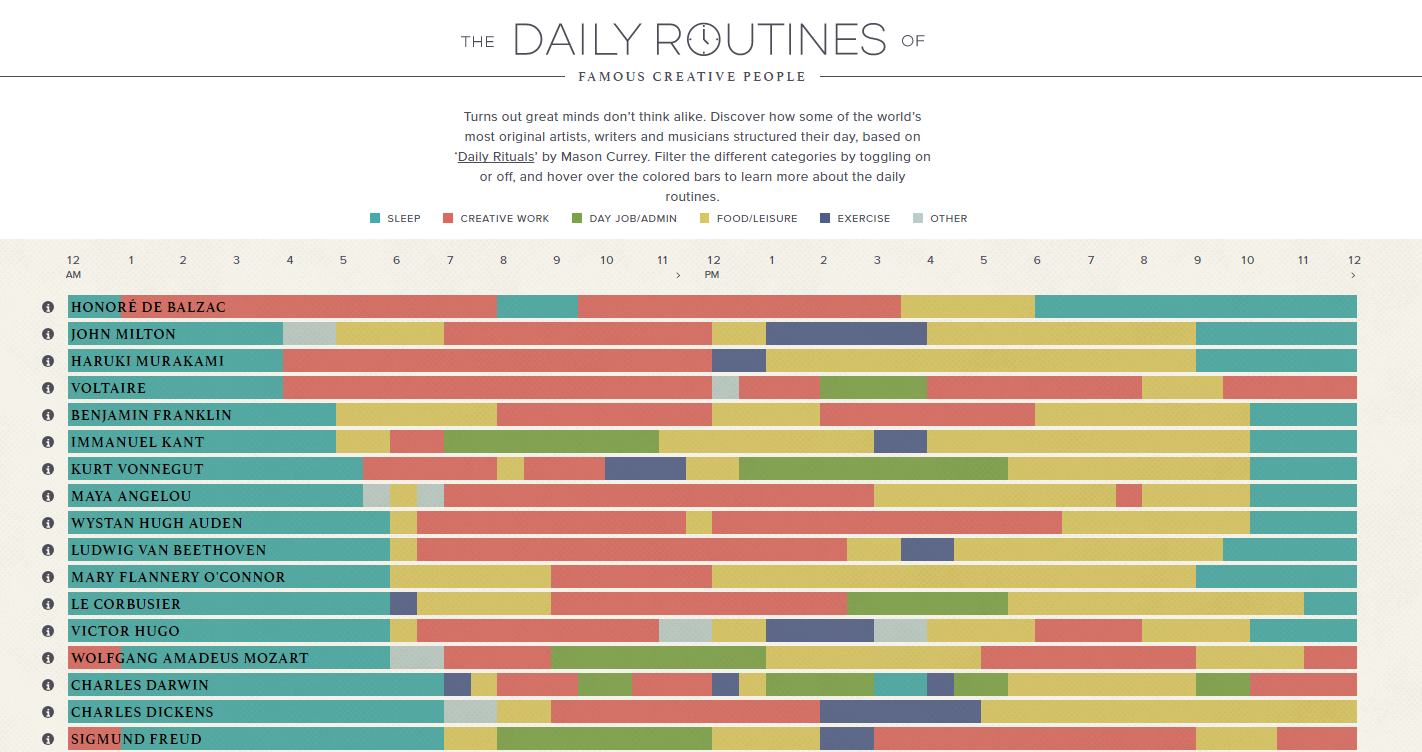
Take a look at this example. What insights can you gather? What’s the story behind the data?
Conclusion
Knowledge experts can prevent learners from drowning in the deluge of data by helping them see the meaningful and valuable message in numbers and statistics. We may have only several seconds to captivate their attention. Shocking statistics and interactive, well-designed and understandable data visualization are some of the effective approaches.
References
John Naish. Warning: brain overload.
The Times. June 9, 2009 Jacquelyn Smith, Business Insider. 7 excellent ways to start a presentation and capture your audience’s attention.
Financial Post. July 7, 2014 Are you Interpreting eLearning Data Correctly?
Daniel Waisberg. Tell a meaningful story with data.
Think with Google. March 2014 Brian Clark. Become a Master of Metaphor and Multiply Your Blogging Effectiveness.
Copyblogger. May 2, 2007 Rob Chimsky. The lake and the stream: analogies to assist your big data strategy
Evan Sinar. 7 Data visualization types you should be using more (and how to start).
Medium. February 14, 2016 Lisa Morgan. Data Storytelling: What It Is, Why It Matters.
InformationWeek. May 30, 2016 Engaging Technical eLearning – Tips on Design and Delivery
Tip #66 – Creating Big Lessons by Using Small Data
Vignettes Learning
“Helping Learners Learn Their Way”