Synthesis:
Developing outstanding visual story eLearning modules requires careful planning, collaboration and implementation. The New York Times’ Snow Fall, an online multi-media news report, is a perfect example of well-planned and well-crafted visual storytelling. I included an outline for visual narrative development from a paper by Edward Segel and Jeffrey Heer; and important visual storytelling tips from the NY Times developers. __________________________________________________________________________

The New York Times reaped praises for their web report entitled Snow Fall: The Avalanche of Tunnel Creek, published last December 20, 2012. Snow Fall is a story about the plight of three people who were killed by a huge avalanche at Tunnel Creek. The story includes an eyewitness account by Elyse Saugstad, a skier who was swept down the mountain during the tragic avalanche.
By using engaging videos, breathtaking 3-D graphics and a compelling narrative, New York Times showed how visual storytelling should be done. NY Times maximized the multi-media capability so that the readers can experience the story.
Katherine Schulten notes that “Snow Fall” was described by a number of writers as “ ‘a beautiful integration of video, photos and graphics that makes multimedia feel natural and useful’; the ‘best designed big Web story ever’; and ‘the future of Web storytelling.’ “
Snow Fall garnered around 2.9 million visits and more than 3.5 million page views. This web report was shared by more than 10,000 Twitter users. During its peak, Snow Fall had as many as 22,000 user visits.
Interestingly, Edward Segel and Jeffrey Heer already foretold two years earlier, that a visual narrative such as Snow Fall would eventually emerge. Segel and Heer, in Narrative Visualization: Telling Stories with Data cite the evolving significance of visual narratives to media, content developers, and communicators:
“In recent years, many have commented on the storytelling potential of data visualization. News organizations including the New York Times, Washington Post, and the Guardian regularly incorporate dynamic graphics into their journalism. Politicians, activists, and television reporters use interactive visualizations as a backdrop for stories about global health and economics and election results. A recent feature in The Economist explores the proliferation of digital data and notes that visualization designers are “melding the skills of computer science, statistics, artistic design and storytelling. Static visualizations have long been used to support storytelling, usually in the form of diagrams and charts embedded in a larger body of text. In this format, the text conveys the story, and the image typically provides supporting evidence or related details. An emerging class of visualizations attempts to combine narratives with interactive graphics. Storytellers, especially online journalists, are increasingly integrating complex visualizations into their narratives.”
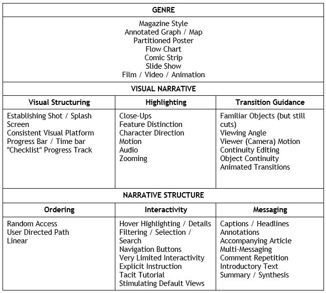
Edward Segel and Jeffrey Heer provide this category checklist to help eLearning developers organize their visual narratives:

Finally, here are important tips from the NY Times Snow Fall lead developers, published in source.mozillaopennews.org:
Catherine Spangler, Video Journalist: “The challenges of crafting multimedia to complement a text-based story were the same challenges faced in any storytelling endeavor. We focused on the pacing, narrative tension and story arc—all while ensuring that each element gave the user a different experience of the story. The moving images provided a much-needed pause at critical moments in the text, adding a subtle atmospheric quality. The team often asked whether a video or piece of audio was adding value to the project, and we edited elements out that felt duplicative. Having a tight edit that slowly built the tension of the narrative was the overall goal.”
Andrew Kueneman, Deputy Director, Digital Design: “We learned that allowing for a good amount of feedback from our colleagues as the project starts to take its final shape—especially for something this complex and long—was valuable. You can’t work inside a bubble with thousands of words and probably hours of footage and animated graphics and expect to be able to approach the various drafts with a fresh/clear perspective. We also learned that building or prototyping a behavior or presentation device that you haven’t used or seen before is really the only way to fairly evaluate those ideas—and we were able to weed out difficult things and find success and surprises in others by actively experimenting along the way.”
Read my related blog
Instant and Rapid One-Minute Learning for mLearning and eLearning.
Works Cited
Heer, J. and Segel, E. (2010), Narrative Visualization: Telling Stories with Data
New York Times Team. How We Made Snow Fall: A Q&A with the New York Times Team. January 1, 2012
Romenesko, J. More Than 3.5 Million Page Views for New York Times’ ‘Snow Fall’ Feature. December 27, 2012.
Schulten, K. Reading Club | ‘Snow Fall: The Avalanche at Tunnel Creek’. January 2, 2013.
Ray Jimenez, PhD
Vignettes Learning
“Helping Learners Learn Their Way”
